
Remmonchatta Re-design
/Remonchatta
Remonchatta is a Birmingham based sports podcast hosted by Tay and Rico which covers a news and viewpoints on a variety of sports but with an emphasis on Football and Combat sports such as UFC. I was commissioned to create a logo, and a banner for their YouTube channel in order to create a more vibrant, professional look and feel to the brand whilst also being instantly recognisable as their content.
The Banner
For the banner I initially had discussions with the client to narrow down what exactly they were looking for in regard to tone and style, as well as mood boarding things they they were inspired by in order to get the end result looking as close as to what they had envisioned. In regard to they style that they wished to put forward they had decided on a urban graffiti style with good colour contrast that depicted them in a stadium.
I then created mood boards of my own to more narrow down the style taking inspiration from graffiti artists such as Kiptoe as well as inspiration from the branding created for the Birmingham Commonwealth games 2022 in order to really bring some local feeling into the piece.
I them moved onto initial sketches and block-outs to set the composition and flow of the piece before adding the colour and details before shading and adding various effects. I also wanted to but in references to both Birmingham and football and as a result included famous landmarks such as the Birmingham Bull, the Bullring shopping Centre, the Rotunda and the Birmingham Library. In regard to the sports references In included the world cup, and modeled the pose Tay and Rico were standing in off the statue of Manchester United’s famed holy trinity of Denis Law, Sir Bobby Charlton, and George Best.

Remonchatta banner initial sketch and rough colour

Work in progress more final colours and textures, Birmingham themed lift hand side flowing into the centre.

Finalised textures and flow no logo

Final banner with logo
The Logo
For the logo the client wanted something that represented them as a sporting podcast and that they could put onto sports wear for the next time they did their famed Sutton Classico football event. So we Decided on a football team inspired logo.
The parameters were that the logo had to be bold and reminiscent of some of the older style logos but with nothing too complex, so no overly complex crests and heraldry. Also the logo needed to tie into the colour pallet of the banner in order to further solidify the band guidelines and to further push forward their brand image. To achieve this I created a mood board of football logos mainly those found throughout the European leagues in order to achieve a look and feel that like the logo would look and feel (like the banner) more local. As such I tried to find similar fonts and layouts to those found in the Premier League and the Bundesliga and was particularly inspired by those such as Brighton, Dortmund and Manchester City.
I then created various designs whittled it down to three final logos and then sent them off to the client for the final pick before vectoring it and sending it back for the final time.

Initial designs with matched colours

Initial designs with colour swap
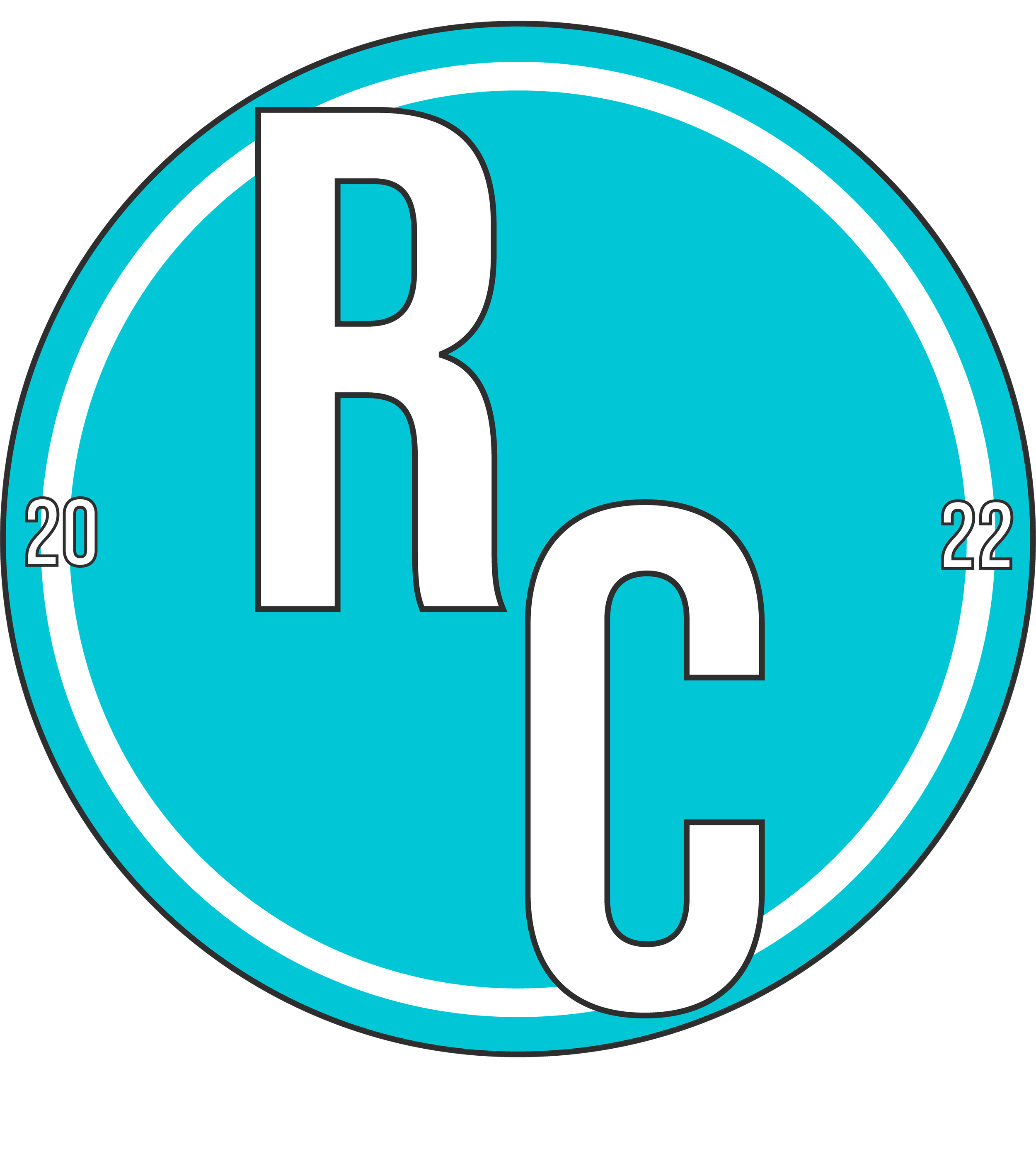
The Final Design