Rugged Nature Branding and Packaging:
/Rugged Nature is an all natural male grooming company which created a wide variety of products all packaged in eco friendly and recyclable packaging. I was brought into the company in October 2021 and was tasked with doing a brand refresh which included: Updating the website, creating new packaging, creating and expanding upon the brand guidelines, as well as generating social media content to push forward the brands ethos and messages.
Packing:
For the packaging I was tasked with updating the pre-existing labels in order to make them stand out more to be shop shelf ready. To do this I first researched into similar cosmetics companies, as well as leading male grooming cosmetics companies in order to see how they were presenting their products, and how they were reaching out to their target audience. I also looked at the colours and layouts used by these respective companies and looked at whether I could find a unique gap in market or attempt to emulate the aesthetics and layouts in hopes of creating something just as effective.
I also looked into the research in which Rugged Nature itself had done into its packaging through the use of consultants which helped asses where the brand was at and what core components the brand should keep moving forward. This provided me with other information at my disposal which combined with my own research allowed me to come to the following conclusion:
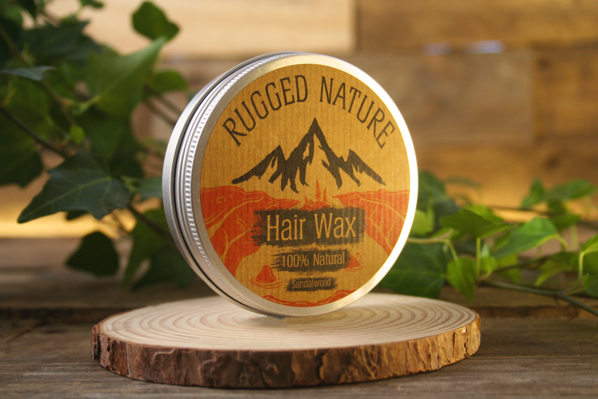
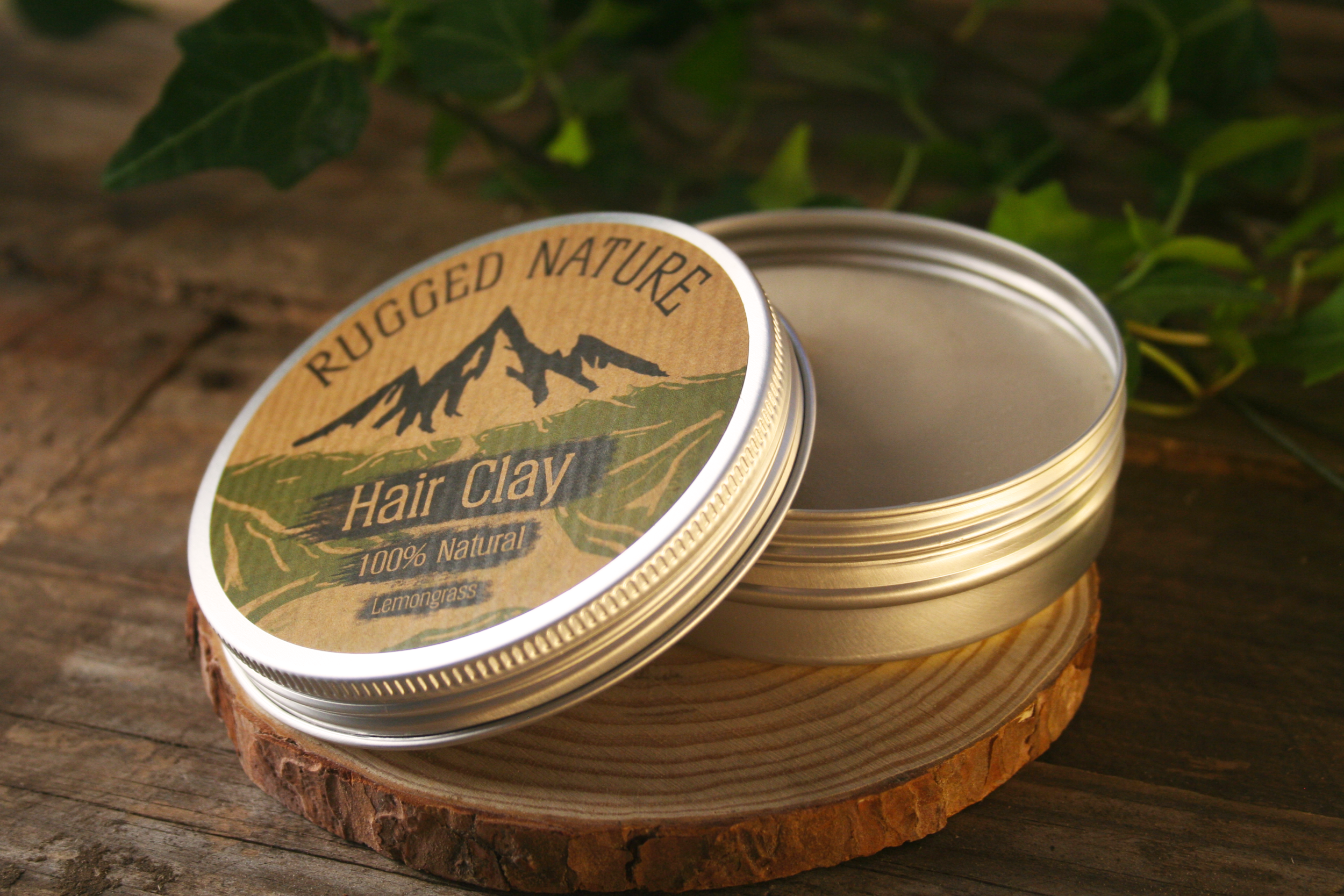
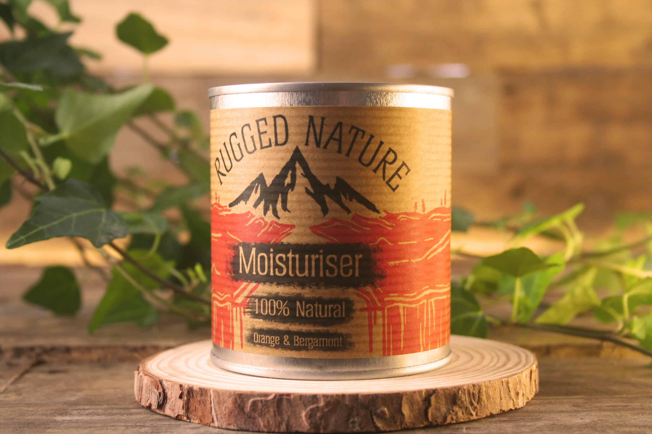
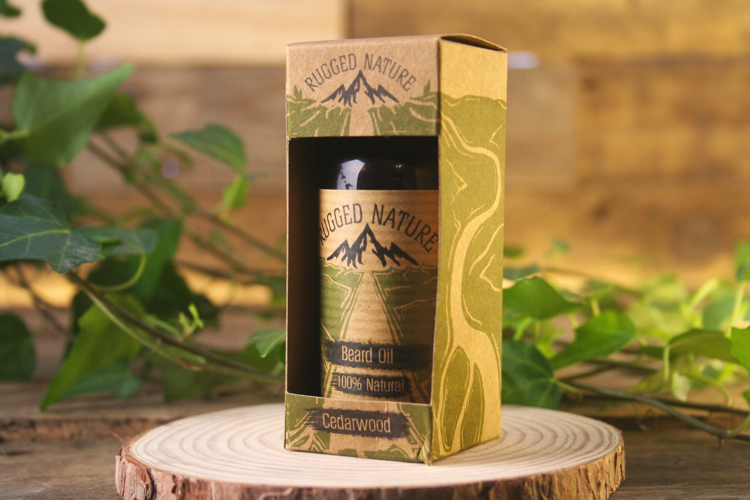
That the brown kraft paper stickers we were currently using helped to emulate the ‘eco’ element of the brand with its recycled look.
Any colours that are added to the packaging must be earthy and natural tones in order to further compliment the recycled and eco nature of the kraft paper stickers.
The logo should thus far remain the same as it had already built up a reputation and following.
That we should stick to four core colours that could both act almost as a gradient, as well as contrast each other as to stand out more on the shelves.
with these points in mind I set out with designing the packing.
For the unique design elements I looked toward old lino and woodblock printing and the various look and texture that they created. I then went about creating landscape images in this style of multiple hills and rivers with the logo placed top centre of the packaging so that the river drew the viewers eye from any information in the foreground all the way to the logo at the top.
For the informative text such as the product name and scent I initially stuck with the black helium text that the packaging previously had used. However, this seemed to fade into the background and didn’t stand out as much as I would have liked, as such I created these distressed ink textures that would allow me to create a more ‘rugged’ look to the design, I would then have the text be translucent in this design to have the it stand out from the black texture that surrounded it and thus have it stand out on the initial packaging as well.
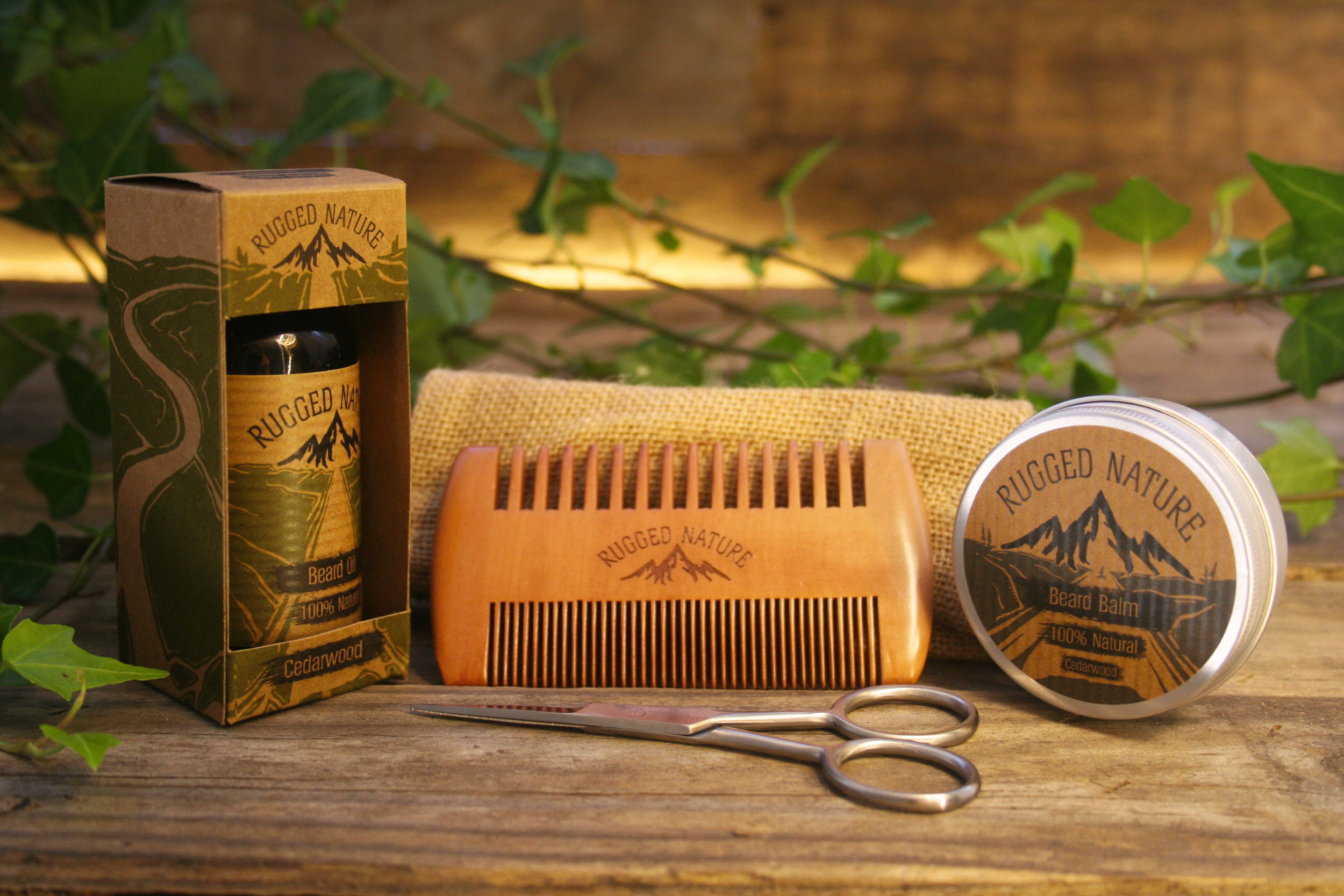
Photography:
I was also tasked with photographing the new packaging once it had been printed. With the help of my boss we created a studio using wooden pallet boards as a backdrop and had a variety of props that I was able to swap and switch out depending on the product and specific composition we were going for.
The props were all purposely chosen due to the fact that they were all associated with the outdoor, and workshop aesthetic and thus fit our brand guidelines and image, and would allow us to target out main audience more. The more plant based props as well as the green canvas bag helped to break up the brown colours of the background and would also allow us to both compliment and contrast the four colour variations of packaging that we had created.
To further allow these to stand out I used a mix of cold white LED and warm white LED lights to create a further colour contrast in the tone of the images which I could add to and boost in post. The Warm lights were used as the main Lightsource allowing me to create a warm comfortable aesthetic with the cold white lights being used as a highlight and fill light.
These photos were then taken into photoshop in order to further enhance the warm look and feel as well as to up the vibrance and contrast of the background greens in order to make the contrasting packaging stand out.