Rugged Nature Branding and Packaging 2.0
/Throughout my time at Rugged Nature I have produced a wide array of artistic content for the brand in order to promote the company on social media, at various trade shows, and through designing Websites. Throughout all of this I have strived to keep a consistent tone and style through what we post and the content we put out across all platforms.
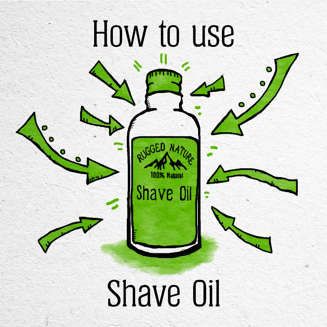
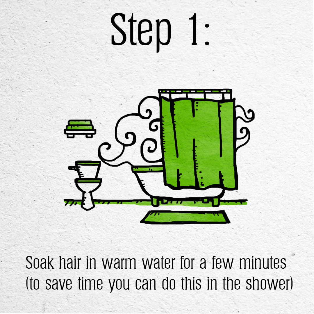
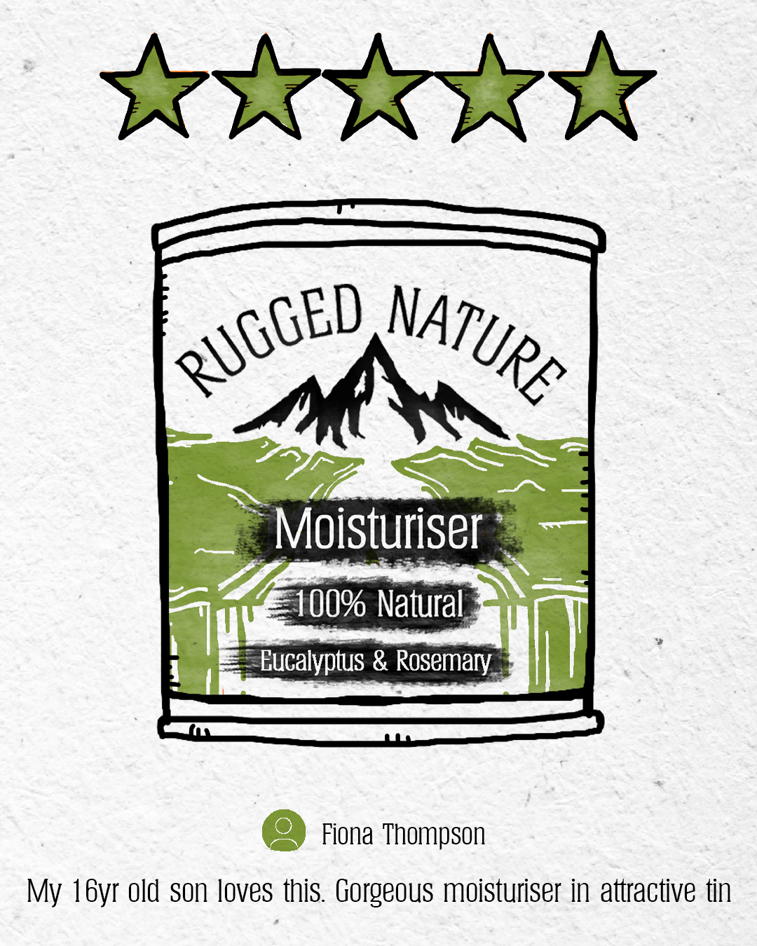
In regard to the social media, I was tasked with creating multiple quick illustrated and animated posts to promote products and the lifestyle of the company. Posts typically ranged from reviews, How to Guides and in more recent times news and behind the scenes.
When concepting the style for these posts I had to consider the the following:
The style had to be eye-catching and stand out drawing viewers in to interact with the posts.
The style had to follow the brand guidelines and represent the brand in the online space
The style had to be simple and easy to replicate and iterate, due to both the fast paced nature of the company, as well as laying out a future guideline for any new/ future artists
The style had to be easy to animate.
With this in mind I started conceptualising. I knew that I wanted the style to have a cartoonish element to it with characters broken down into simple shapes with distinct black outlines. Characters would also have exaggerated features such as noses and beards, and would be drawn in a manner that would be easy to animate. Objects and landscapes would also follow this trend, and both would employ a use of crosshatching in order to create an more rough and sketched approach to represent the ‘Rugged’ in Rugged Nature.
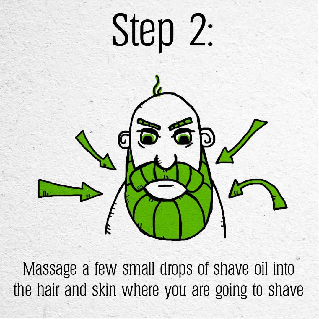
When researching for this I looked into a range of game art and comic book art in order to achieve this look, and as such I drew inspiration from a variety of sources such as Bad North, Diary of a Wimpy Kid, Adventure time and Cup Head each one of these employed different style and way of exaggerating yet simplifying certain features on their characters in order to achieve a desired cartoonish look that still kept to proper proportions and leant themselves to a more traditional style of animation.
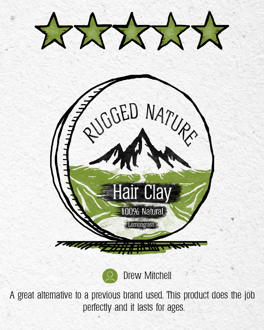
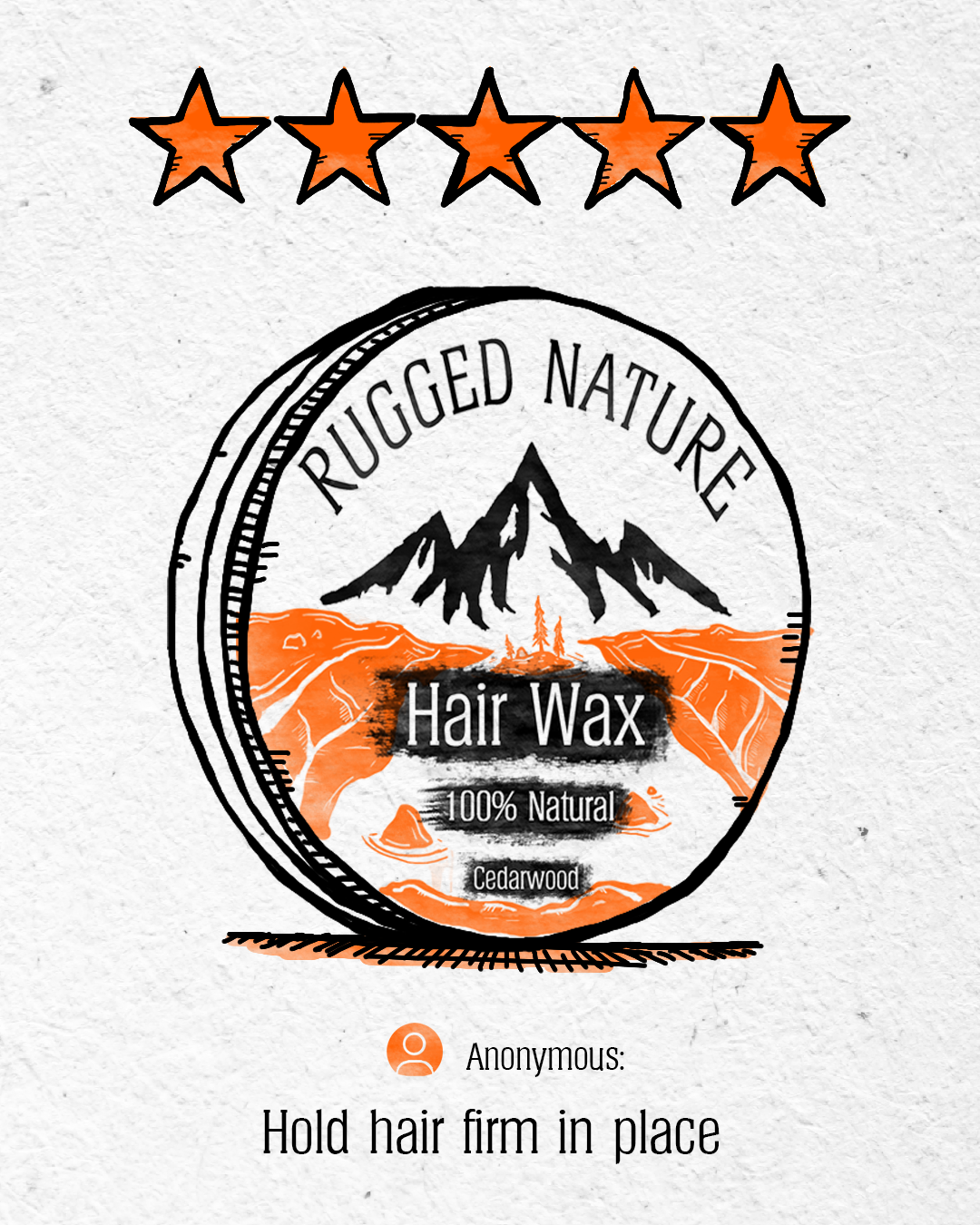
The colour pallet would also be limited in order to comply with the four key colours outlined in the brand guidelines. However upon testing some colours appeared to work better for certain posts, for example, the greens and blues fit well for more character and landscape driven images as they more closely resembled the more soothing natural colours found in nature, and as such gave these posts a more friendly approach then the red and orange did. That being said red and orange worked great for reviews, particularly the orange, which helped to break up the greens on the Instagram grid and add a nice sense of contrast to our overall display and also helped to drive interaction from our audience with these posts.
The background of the posts were also considered, opting for a rough white paper texture that with the right blend settings on photoshop would allow the texture to visible with the colour, allowing to me to more closely emulate the look and feel of traditional media, whilst still keeping a somewhat clean style that allowed the colours to pop.
When animating I took inspiration from the aforementioned sources earlier, but also from the early work of Max Fleischer and Walt Disney. Their style of ‘rubber hose’ animation utilised the key mechanics of squash and stretch in an exaggerated way. This is something that i wanted to take on board as i thought that it would suite the style of drawing well.